This data contains suspected botulism cases in the United States dating back to the year 1899. This data is provided by the CDC Botulism Consultation Service, the Alaska Division of Public Health, and California Department of Public Health.These organizations are the only sources of non-infant botulism anti-toxin in the U.S. and they collect epidemiological and medical information from suspected botulism cases all over the U.S. This data set contains 5 columns and 2280 rows. The variables in this data set include state, year, botulism transmission type (BotType), botulism toxin type (ToxinType), and frequency count (Count).
Link to the data set: https://data.cdc.gov/Foodborne-Waterborne-and-Related-Diseases/Botulism/66i6-hisz/about_data
Openning the Data
I will start by openning the libraries of the packages that I will need for data processing/cleaning and exploratory analysis. install.packages(readxl)
library(dplyr)
Attaching package: 'dplyr'
The following objects are masked from 'package:stats':

    filter, lag
The following objects are masked from 'package:base':

    intersect, setdiff, setequal, union
── Conflicts ────────────────────────────────────────── tidyverse_conflicts() ──
✖ dplyr::filter() masks stats::filter()
✖ dplyr::lag()    masks stats::lag()
ℹ Use the conflicted package (<http://conflicted.r-lib.org/>) to force all conflicts to become errors
library(ggplot2)library(here)
here() starts at C:/Users/rrsta/OneDrive/Desktop/MADAcourseexercises/MADAcourserepo
library(readr)library(broom)library(readxl)
Next, I will write code to read the csv file.
list.files() #confirm that the file is in the working directory
cdcdata <-read_csv("Botulism.csv") #read the csv file
Rows: 2280 Columns: 5
── Column specification ────────────────────────────────────────────────────────
Delimiter: ","
chr (3): State, BotType, ToxinType
dbl (2): Year, Count

ℹ Use `spec()` to retrieve the full column specification for this data.
ℹ Specify the column types or set `show_col_types = FALSE` to quiet this message.
Next I will look at the data structure and summary.
summary(cdcdata)
    State                Year        BotType           ToxinType
 Length:2280        Min.   :1899   Length:2280        Length:2280
 Class :character   1st Qu.:1976   Class :character   Class :character
 Mode  :character   Median :1993   Mode  :character   Mode  :character
                    Mean   :1986
                    3rd Qu.:2006
                    Max.   :2017
     Count
 Min.   : 1.000
 1st Qu.: 1.000
 Median : 1.000
 Mean   : 3.199
 3rd Qu.: 3.000
 Max.   :59.000
Now I will check which unique variables are present in the BotType, ToxinType, and State Categories by using the unique function.
unique_bottype <-unique(cdcdata$BotType)unique_toxintype <-unique(cdcdata$ToxinType)unique_state <-unique(cdcdata$State) #Makes a new column of unique values for an existing columnprint(unique_bottype)
It seems that there are multiple values of the factor bottype that have the same meaning. These values that should be grouped together are “AB”, “Ba”, “A&B”, and “Ab”; “B/F” and “Bf”; “A/B/E” and “ABE”.
Cleaning the Data
First, I will rename the values of ToxinType that can be combined to a single value using mutate().
cdcdata2 <- cdcdata %>%mutate(ToxinType =case_when( ToxinType %in%c("AB", "Ba", "Ab", "A&B") ~"AB", ToxinType %in%c("B/F", "Bf") ~"BF", ToxinType %in%c("ABE", "A/B/E") ~"ABE",TRUE~ ToxinType )) #I found how to mutate multiple values of one variable by using the base function of mutate and then asking ChatGPT how to combine multiple values using mutate and not just one.unique_toxintype2 <-unique(cdcdata2$ToxinType)print(unique_toxintype2) #Use unique to check that the unique values have merged into a single value, in this case it was sucessful
I will now change the character variables: State, BotType, and ToxinType into factor variables so they are simpler to analyze as levels.
cdcdata2$State <-as.factor(cdcdata2$State)cdcdata2$ToxinType <-as.factor(cdcdata2$ToxinType)cdcdata2$BotType <-as.factor(cdcdata2$BotType) #Use the as.factor function to convert each of these character variables to factors that will be simpler to work withstr(cdcdata2) #check the variable types of the data frame
Now I will rename the E,F column to EF for consistency.
cdcdata3 <- cdcdata2 %>%mutate(ToxinType =as.character(ToxinType), #first you must change the factor toxin type to a character variableToxinType =ifelse(ToxinType =="E,F", "EF", ToxinType), #Then, you convert the value "E,F" into "EF"ToxinType =as.factor(ToxinType)) #convert toxin type back into a factorprint(levels(cdcdata3$ToxinType)) #check the levels of the toxintype factor by using the print(levels()) function
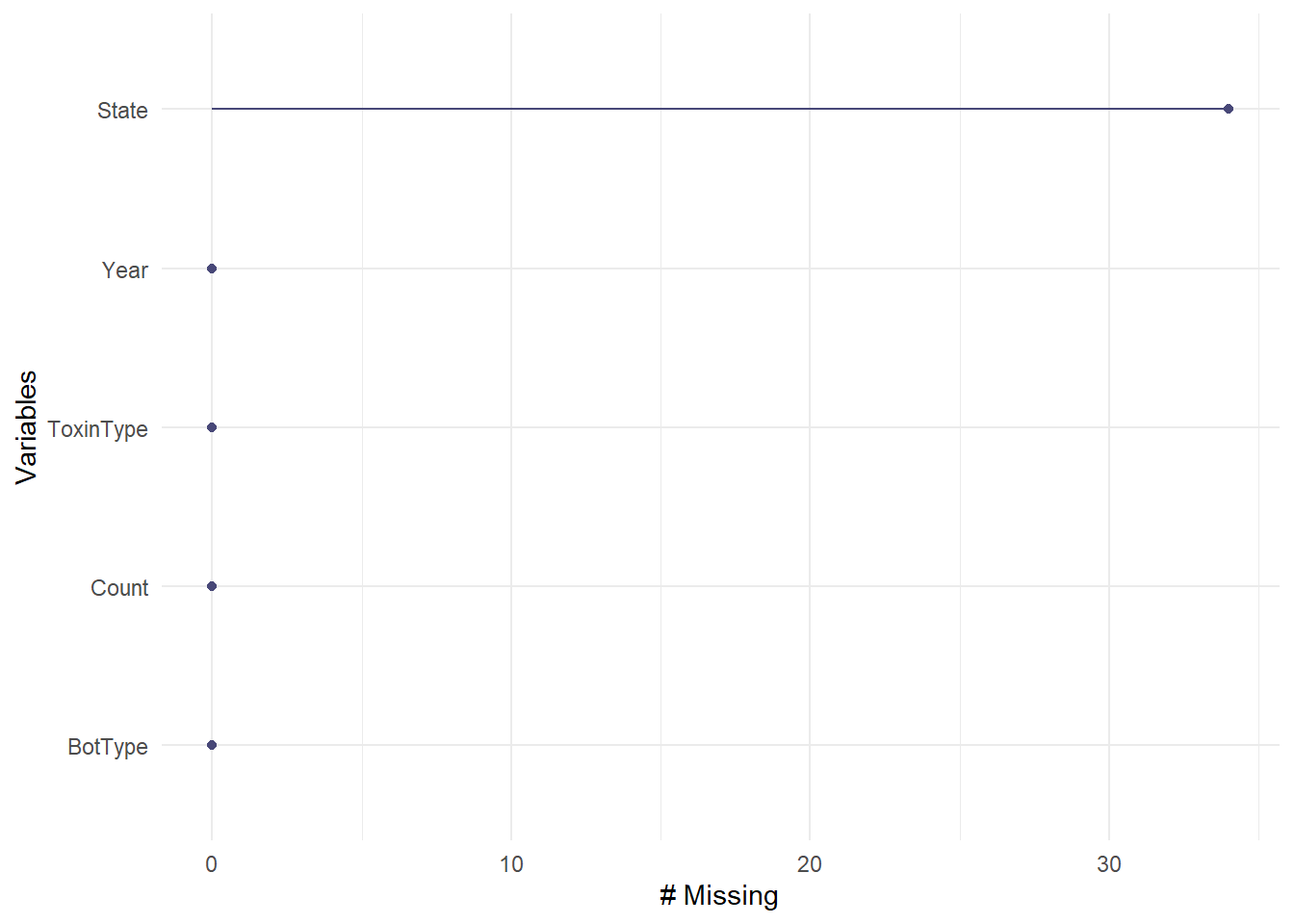
Now I will check for missing values in all of the variables. The “Unknown” values for ToxinTupe, BotType, or State are NOT missing values because they can be analyzed as a factor level and correspond to important data of case counts. I will determine which variables have the most missing data using a nanair package function called gg_miss_var.
gg_miss_var(cdcdata3)
There are over 30 missing values for state, but this is a relatively small percentage compared to the total of 2850 values, so I will delete these missing values.
cdcdata4 <- cdcdata3 %>%#Create a new data frame called cdcdata4drop_na(State) #Drop values of state that are NAskimr::skim(cdcdata4) #Check the number of rows
Data summary
Name
cdcdata4
Number of rows
2246
Number of columns
5
_______________________
Column type frequency:
factor
3
numeric
2
________________________
Group variables
None
Variable type: factor
skim_variable
n_missing
complete_rate
ordered
n_unique
top_counts
State
0
1
FALSE
50
Cal: 343, Was: 143, Tex: 107, Col: 98
BotType
0
1
FALSE
4
Inf: 1124, Foo: 899, Wou: 151, Oth: 72
ToxinType
0
1
FALSE
9
A: 958, B: 778, Unk: 369, E: 72
Variable type: numeric
skim_variable
n_missing
complete_rate
mean
sd
p0
p25
p50
p75
p100
hist
Year
0
1
1985.50
26.60
1899
1976
1992
2006
2017
▁▂▂▅▇
Count
0
1
3.22
4.66
1
1
1
3
59
▇▁▁▁▁
34 values were deleted as the number fo rows changed from 2280 to 2246. Now since all of the missing values are taken care of, we will explore to data to find outliers.
Exploratory Analysis
I will use exploratory analysis and create figures to summarize the data distribution and to identify any outliers.
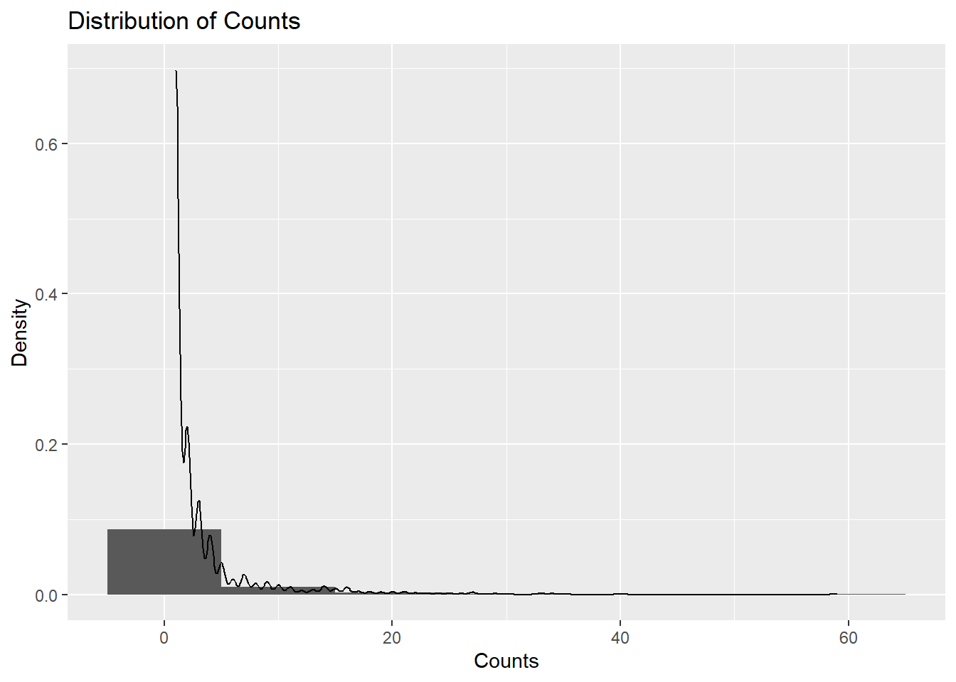
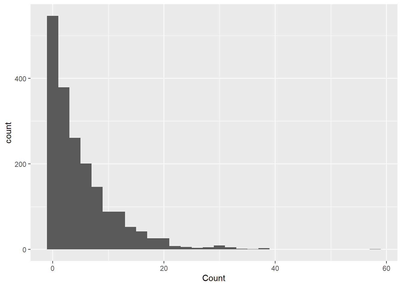
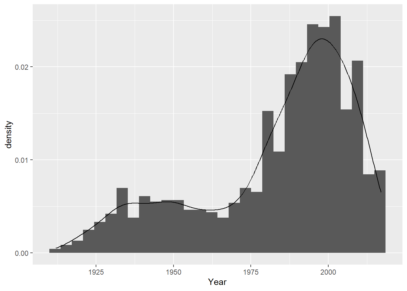
Because the outcome of interest is botulism case count (Count), I will check the normalcy and distribution of the variable count. I used ChatGPT to ask what kind of plot I can use to show me the distribution of Count. If output a code for a histogram that shows a density distribution. This shows that the data is highly right-skewed.
ggplot(cdcdata4, aes(x = Count)) +geom_histogram(binwidth =10, aes(y = ..density..)) +geom_density(alpha =0.2) +labs(title ="Distribution of Counts", x ="Counts", y ="Density")
Warning: The dot-dot notation (`..density..`) was deprecated in ggplot2 3.4.0.
ℹ Please use `after_stat(density)` instead.
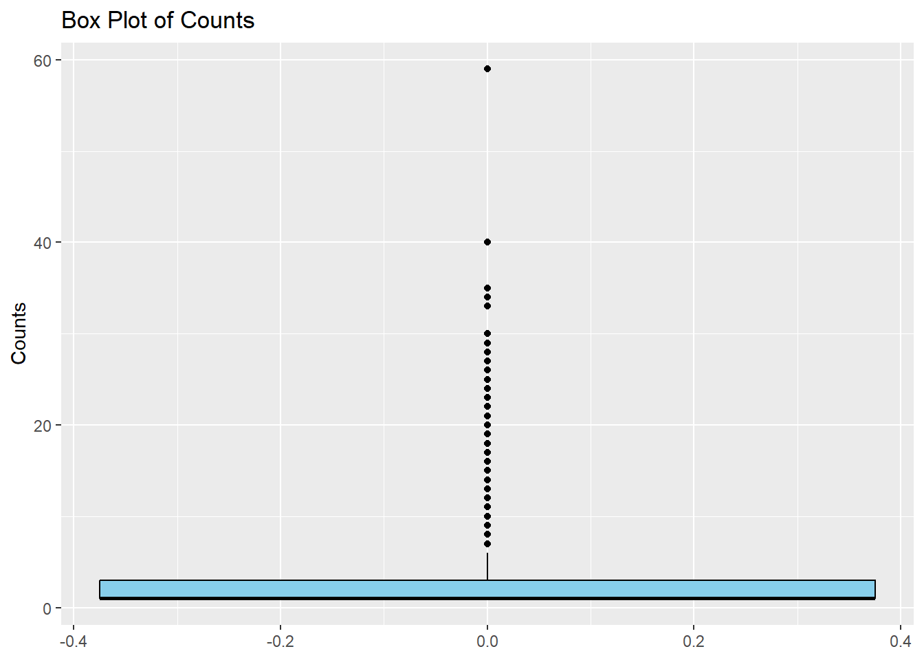
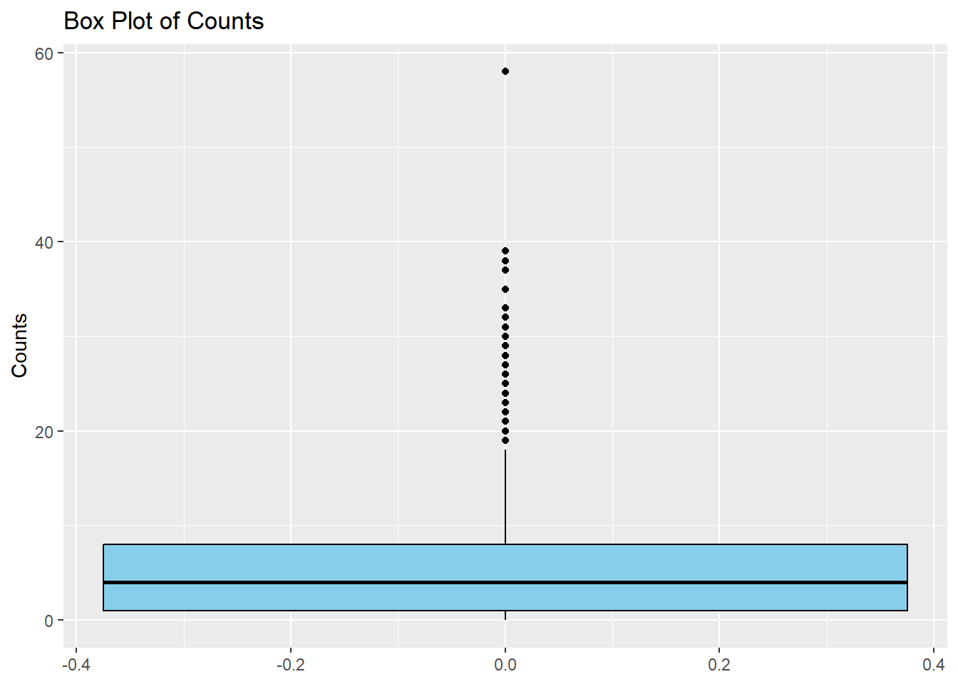
I will now make a simple boxplot using ggplot to confirm the results in the density distribution given above.
ggplot(cdcdata4, aes(y = Count)) +#Create a boxplot of count geom_boxplot(fill ="skyblue", color ="black") +#Fill colors are used as box is far too compressed to notice otherwiselabs(title ="Box Plot of Counts", y ="Counts")
Even though the plot is highly skewed, there is a single outlier that stands out, close to a count of 60. I will try and find which year and state values are associated with this maximum count and very that there was an unusual outbreak, using online literature.
summary(cdcdata4$Count)
   Min. 1st Qu.  Median    Mean 3rd Qu.    Max.
  1.000   1.000   1.000   3.223   3.000  59.000
I found the max count value to be 59, so I will identify the row of this value.
max_row <- cdcdata4$Count ==59#create a data frame just including the max value of countmax_states <- cdcdata4$State[max_row]max_years <- cdcdata4$Year[max_row] #Produce data frames with the year and state corresponding to the max countprint(max_states)
print(max_years) #print the data frames with the corresponding years and states
[1] 1977
Now seeing that this outlier is from 1977 Michigan, I will search for this outbreak. Reference: https://pubmed.ncbi.nlm.nih.gov/707476/ In 1977, there was the largest botulism outbreak in American history due to a foodborne outbreak at a Mexican restaurant, from improperly canned Jalapenos. This data point is important and will therefore be kept.
I will now check the frequency of the factor variables
Year
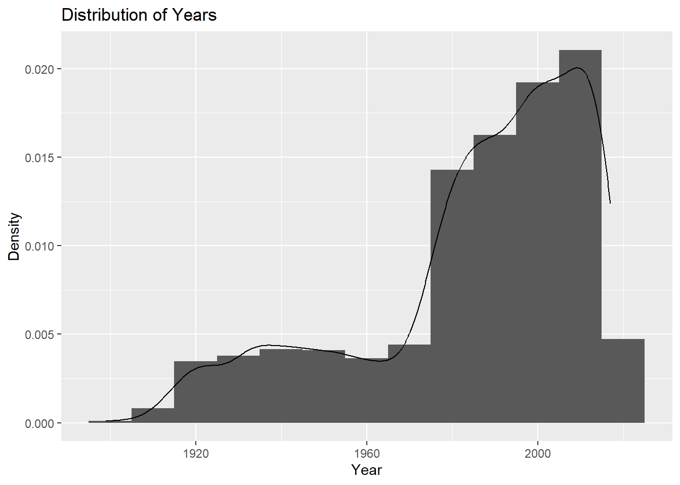
I will check the frequency of year using a histogram plot, similar to the distribution plot used for count.
ggplot(cdcdata4, aes(x = Year)) +geom_histogram(binwidth =10, aes(y = ..density..)) +geom_density(alpha =0.2) +labs(title ="Distribution of Years", x ="Year", y ="Density")
Most data has been collected in more recent years, so the data is left-skewed.
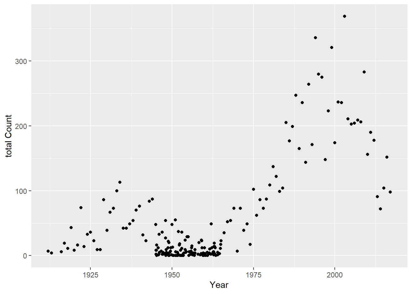
I will not plot count versus year. First I will make a total count variable that takes the sum of all state counts for a year
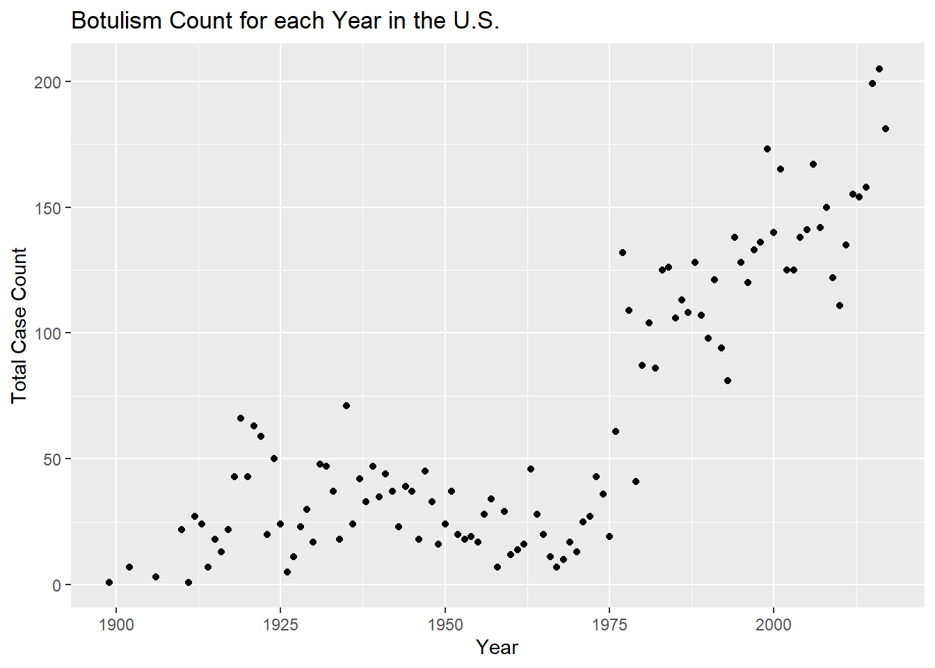
totcount_year <-aggregate(Count ~ Year, data = cdcdata4, FUN = sum) #Use aggregate() to find the sum count for each year valueggplot(totcount_year, aes(x = Year, y = Count)) +#use geom_point() to create a scatterplot for the total year count data frame that was createdgeom_point() +labs(title ="Botulism Count for each Year in the U.S.", x ="Year", y ="Total Case Count")
It looks like total botulism cases have greatly increased in recent years, botulism surveillance has greatly improved, or the suspected botulism case had changed around 1970 to become more broad. Whichever is the case, the total botulism case count per state has greatly increased starting around 1970.
Count versus State
First I will see the total cases per state. For this I will first aggregate the count values to get a total for each state. Next, I will make a histogram of the total case count versus state.
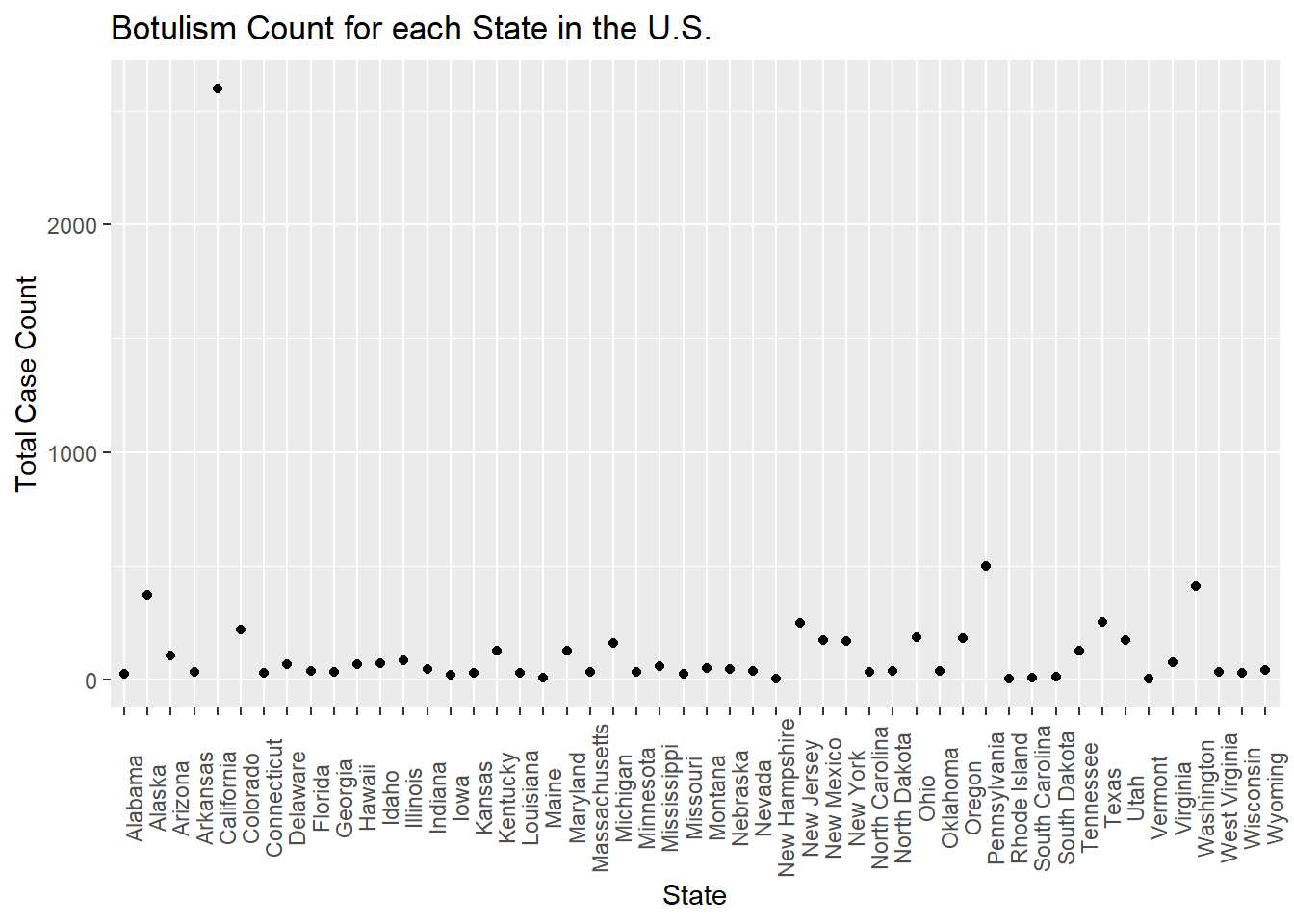
totcount_state <-aggregate(Count ~ State, data = cdcdata4, FUN = sum) #aggregate and sum the count by the state valueggplot(totcount_state, aes(x = State, y = Count)) +#use geom_point() to create a scatterplot for the total year count data frame that was createdtheme(axis.text.x =element_text(angle =90)) +#Rotate x axis labelsgeom_point() +labs(title ="Botulism Count for each State in the U.S.", x ="State", y ="Total Case Count")
One state has an extremely high total case count. I will identify max value by using the same method I used when identifying the max count value.
summary(totcount_state) #summary stats for the total count by state data frame
        State        Count
 Alabama   : 1   Min.   :   3.00
 Alaska    : 1   1st Qu.:  29.25
 Arizona   : 1   Median :  44.00
 Arkansas  : 1   Mean   : 144.76
 California: 1   3rd Qu.: 149.50
 Colorado  : 1   Max.   :2598.00
 (Other)   :44
I will find the row that this max takes place in.
max_row <- totcount_state$Count ==2598#create a data frame just including the max value of countmax_state2 <- totcount_state$State[max_row] #find the row in whcih the state with the max total count occursprint(max_state2) #print the data frames with the corresponding state
[1] California
50 Levels: Alabama Alaska Arizona Arkansas California Colorado ... Wyoming
This extreme value takes place in California. I will now fact check this with online literature. Reference 2: https://www.cdph.ca.gov/Programs/CID/DCDC/CDPH%20Document%20Library/IDBGuidanceforCALHJs-Botulism.pdf According to the California DPH, CA reports the highest proportion of wound botulism cases in the U.S.(approx. 26/yr from 2016 to 2019) These are likely related to drug injection. They have also have had 24 foodborne illness cases during this time period. However, this only accounts for 180 of the 2598 reported, suspected cases. I am unsure about including CA in the final analysis for this reason, as the cases may be due to unequal distribution of botulism outbreaks rather than a reporting bias, but it is unknown which one. To decide whether to exclude CA I will explore the distribution of count values based on the year and state.
I will now investigate the aggregate values of state and year counts.
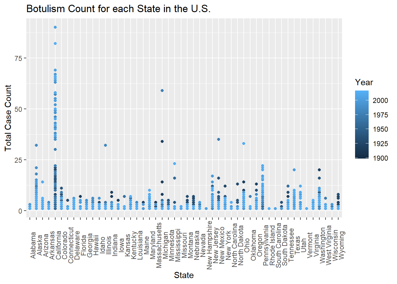
totcount_stateandyear <-aggregate(Count ~ Year + State, data = cdcdata4, FUN = sum) # Use aggregate to calculate the sum of counts for each state and yearggplot(totcount_stateandyear, aes(x = State, y = Count, color = Year)) +#use geom_point() to create a scatterplot for the total year count data frame that was createdtheme(axis.text.x =element_text(angle =90)) +#Rotate x axis labelsgeom_point() +labs(title ="Botulism Count for each State in the U.S.", x ="State", y ="Total Case Count")
Based on the colors of the scatter plot, California has began reporting the largest total case counts of botulism in more recent years, which suggests a change in case definition or reporting bias.
Because of this, I will go back to processing the data. First I will identify if there are duplicate rows in the data
dupcdcdata4 <- cdcdata4[duplicated(cdcdata4),] #Check for duplicated data in the original dataframe and create a new dataframe with duplicatesprint(dupcdcdata4) #Print the duplicate rows
# A tibble: 0 × 5
# ℹ 5 variables: State <fct>, Year <dbl>, BotType <fct>, ToxinType <fct>,
#   Count <dbl>
Because they are zero duplicate rows, I believe that there is not duplicate data present for the California data. In this case, I will remove all of the rows with the value California.
cdcdata5 <- cdcdata4[cdcdata4$State !="California", ] #remove California values from the state variableprint(levels(cdcdata5$State)) #Check the remaining values
California is missing from the levels of the State factor, therefore the removal of the state value, “California” was successful.
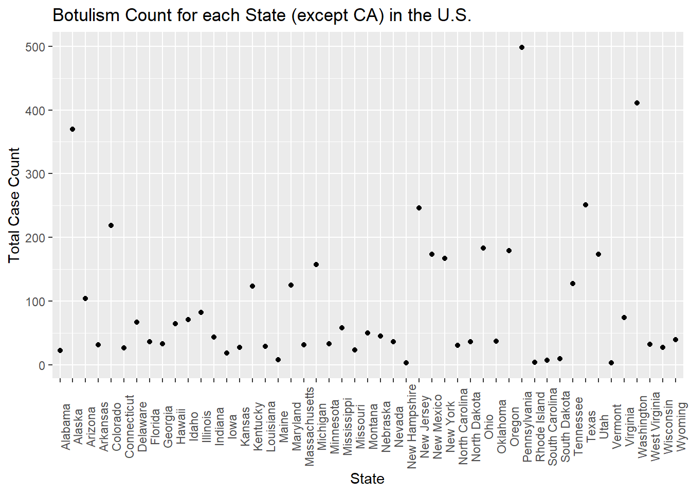
I will now remake the graph comparing the total count values for each state, to reassess outlier state values.
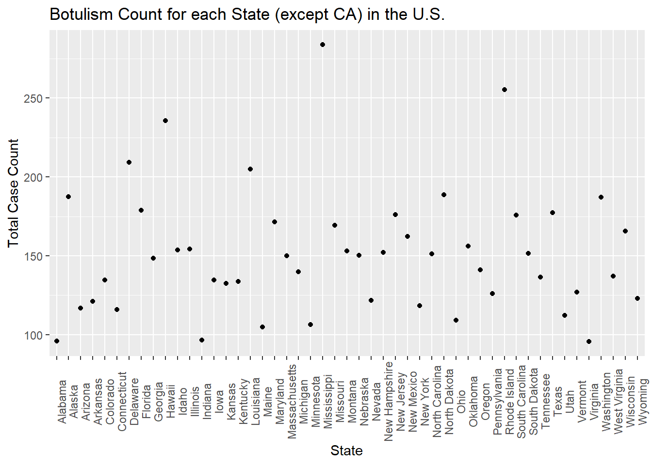
totcount_state <-aggregate(Count ~ State, data = cdcdata5, FUN = sum) #aggregate and sum the count by the state valueggplot(totcount_state, aes(x = State, y = Count)) +#use geom_point() to create a scatterplot for the total year count data frame that was createdtheme(axis.text.x =element_text(angle =90)) +#Rotate x axis labelsgeom_point() +labs(title ="Botulism Count for each State (except CA) in the U.S.", x ="State", y ="Total Case Count")
There are a few higher count values, such as for Oregon, but there seems to be no outstanding outliers. Because of this, we will move on.
BotType
Next, I will examine the total number of cases for each Botulism Type. I will start by aggregating the total count for each type of outbreak. Then I will make a bar plot showing each category.
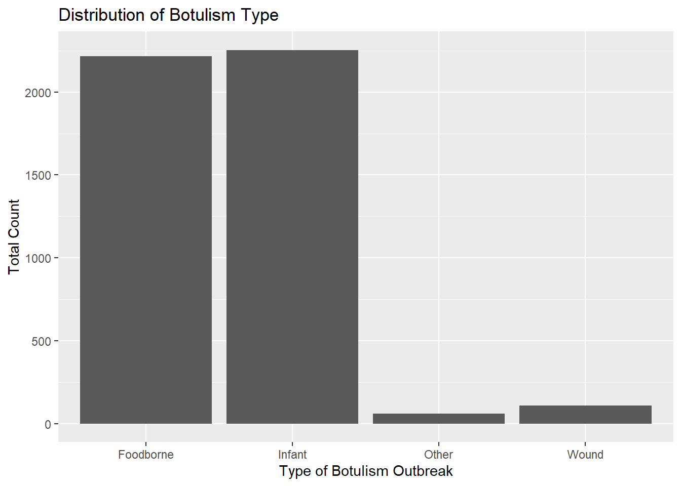
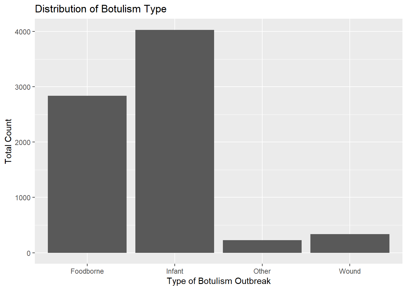
totcount_type <-aggregate(Count ~ BotType, data = cdcdata5, FUN = sum) #Aggregate the count sum by the type of botulismggplot(totcount_type, aes(x = BotType, y = Count)) +geom_bar(stat ="identity") +labs(title ="Distribution of Botulism Type", x ="Type of Botulism Outbreak", y ="Total Count") #Make a bar plot with each differing identity of bot type listed on the x axis
Infant botulism seems slightly more frequent than foodborne botulism. Wound botulism is much less common, but has a frequency close to “other” types of botulism.
Count versus ToxinType
Lastly, I will examine the total number of cases for each Toxin Type. This analysis will be done in a similar way as botulism type. The total count will be aggregated for each toxin type and then
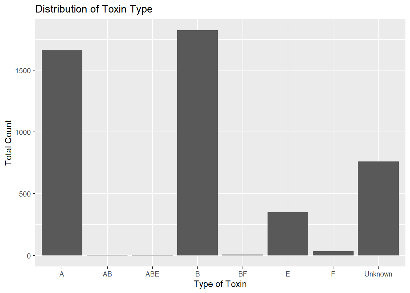
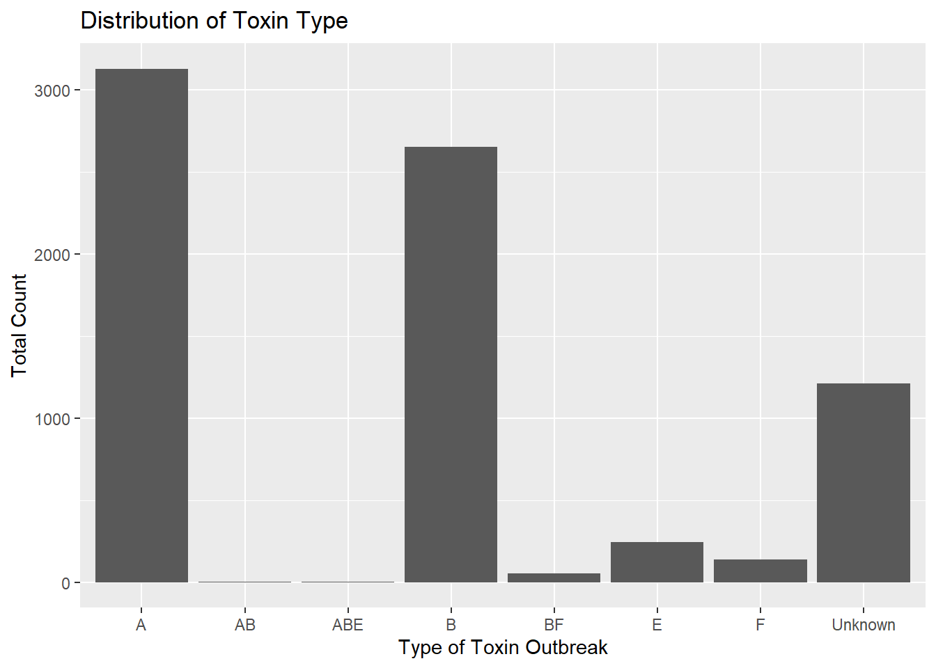
totcount_toxin <-aggregate(Count ~ ToxinType, data = cdcdata5, FUN = sum) #Aggregate the count sum by the type of toxinggplot(totcount_toxin, aes(x = ToxinType, y = Count)) +geom_bar(stat ="identity") +#Make a bar plot with each differing identity of bot type listed on the x axislabs(title ="Distribution of Toxin Type", x ="Type of Toxin", y ="Total Count")
It seems that the toxin type B is responsible for the highest case count, followed by A, unknown, and lastly, E. The toxin type is unknown for a significant chunk of cases in comparison to known types. The known types AB, ABE, BF, and F contribute to a very small portion of botulism cases in the U.S. compared to A, B, and E.
The toxin type corresponds to the strain of bacteria that produced the outbreak. This may mean that toxin type is correlated to the botulism outbreak type. To test BotType and ToxinType correlation, I will use a logistic regression model with these two variables. I use a logistic model with the outcome being botulism outbreak type and the predictor being toxin type.
botvtoxin <-glm(BotType ~ ToxinType, data = cdcdata5, family = binomial) #use glm() to produce a logistic regression with the bottype versus the toxintype variables; regression is binomialsummary(botvtoxin) #ptint the results table
Call:
glm(formula = BotType ~ ToxinType, family = binomial, data = cdcdata5)

Deviance Residuals:
    Min       1Q   Median       3Q      Max
-2.0544  -0.4265   0.5987   0.9397   2.5042

Coefficients:
                  Estimate Std. Error z value Pr(>|z|)
(Intercept)        0.58857    0.07426   7.926 2.27e-15 ***
ToxinTypeAB       13.97749  394.77485   0.035  0.97176
ToxinTypeABE      13.97749  882.74338   0.016  0.98737
ToxinTypeB         1.03981    0.12616   8.242  < 2e-16 ***
ToxinTypeBF       13.97749  394.77485   0.035  0.97176
ToxinTypeE        -3.67962    0.59498  -6.184 6.23e-10 ***
ToxinTypeF         1.39243    0.53851   2.586  0.00972 **
ToxinTypeUnknown  -2.93995    0.21826 -13.470  < 2e-16 ***
---
Signif. codes:  0 '***' 0.001 '**' 0.01 '*' 0.05 '.' 0.1 ' ' 1

(Dispersion parameter for binomial family taken to be 1)

    Null deviance: 2543.3  on 1902  degrees of freedom
Residual deviance: 1881.1  on 1895  degrees of freedom
AIC: 1897.1

Number of Fisher Scoring iterations: 13
It seems that toxin types A, B, E, and unknown are associated with the type of outbreak. Assuming that foodborne is the reference, as it is listed at the first factor level, this might mean there is an association between toxins A, B, E, and unknown with foodborne botulism outbreaks.
This was not confirmed by myself, but current literature suggests that foodborne botulism illness is associated with botulin toxin types A, B, and E. Refrence 3: https://www.ncbi.nlm.nih.gov/pmc/articles/PMC2094941/#:~:text=Botulism%20is%20a%20neuroparalytic%20illness,A%2C%20B%20or%20E).
Summary Stats
The summary statistics of the final data set is shown here.The values for California have not been removed, due to significant they might hold. However, note that California has the highest case counts of any U.S. state.
summary(cdcdata5)
        State           Year           BotType       ToxinType
 Washington: 143   Min.   :1910   Foodborne: 740   A      :790
 Texas     : 107   1st Qu.:1977   Infant   :1028   B      :701
 Colorado  :  98   Median :1993   Other    :  55   Unknown:299
 Oregon    :  95   Mean   :1987   Wound    :  80   E      : 69
 Alaska    :  88   3rd Qu.:2006                    F      : 33
 New York  :  81   Max.   :2017                    AB     :  5
 (Other)   :1291                                   (Other):  6
     Count
 Min.   : 1.000
 1st Qu.: 1.000
 Median : 1.000
 Mean   : 2.438
 3rd Qu.: 3.000
 Max.   :59.000
skim(cdcdata5)
Data summary
Name
cdcdata5
Number of rows
1903
Number of columns
5
_______________________
Column type frequency:
factor
3
numeric
2
________________________
Group variables
None
Variable type: factor
skim_variable
n_missing
complete_rate
ordered
n_unique
top_counts
State
0
1
FALSE
49
Was: 143, Tex: 107, Col: 98, Ore: 95
BotType
0
1
FALSE
4
Inf: 1028, Foo: 740, Wou: 80, Oth: 55
ToxinType
0
1
FALSE
8
A: 790, B: 701, Unk: 299, E: 69
Variable type: numeric
skim_variable
n_missing
complete_rate
mean
sd
p0
p25
p50
p75
p100
hist
Year
0
1
1986.67
25.54
1910
1977
1993
2006
2017
▁▂▂▆▇
Count
0
1
2.44
3.21
1
1
1
3
59
▇▁▁▁▁
This section contributed by Cora Hirst
In this section, I will be generating a dataset that looks similar to the Botulism.csv dataset after Rachel’s processing.
Synthesis of Rachel’s description of the dataset
1903 cbservations across 5 variables:
State factor with 50 levels (States)
Year number with range 1910 - 2017
BotType factor with 4 levels (“Foodborne”, “Infant”, “Wound”, “Other”)
ToxType factor with 9 levels (“A”, “AB”, “ABE”, “B”, “BF”, “E”, “EF”, F”, “Unknown”) “Because the outcome of interest is botulism case count (Count), I will check the normalcy and distribution of the variable count. I used ChatGPT to ask what kind of plot I can use to show me the distribution of Count. If output a code for a histogram that shows a density distribution. This shows that the data is highly right-skewed.”
“I found the max count value to be 59, so I will identify the row of this value. Now seeing that this outlier is from 1977 Michigan, I will search for this outbreak. This data point is important and will therefore be kept.”
“I will check the frequency of year using a histogram plot, similar to the distribution plot used for count. Most data has been collected in more recent years, so the data is left-skewed.”
“It looks like total botulism cases have greatly increased in recent years, botulism surveillance has greatly improved, or the suspected botulism case had changed around 1970 to become more broad. Whichever is the case, the total botulism case count per state has greatly increased starting around 1970.”
“First I will see the total cases per state. For this I will first aggregate the count values to get a total for each state. Next, I will make a histogram of the total case count versus state. One state has an extremely high total case count. I will identify max value by using the same method I used when identifying the max count value. This extreme value takes place in California. I will now fact check this with online literature… I will remove all of the rows with the value California.”
“There are a few higher count values, such as for Oregon, but there seems to be no outstanding outliers. Because of this, we will move
“Infant botulism seems slightly more frequent than foodborne botulism. Wound botulism is much less common, but has a frequency close to”other” types of botulism.”
“It seems that the toxin type B is responsible for the highest case count, followed by A, unknown, and lastly, E. The toxin type is unknown for a significant chunk of cases in comparison to known types. The known types AB, ABE, BF, and F contribute to a very small portion of botulism cases in the U.S. compared to A, B, and E.”
“It seems that toxin types A, B, E, and unknown are associated with the type of outbreak. Assuming that foodborne is the reference, as it is listed at the first factor level, this might mean there is an association between toxins A, B, E, and unknown with foodborne botulism outbreaks.”
Generating synthetic dataset
First, I want to ensure that the distribution of the Counts variable is right-skewed, reflecting that there are many more yearly reports with few cases than reports with many.
set.seed(123)#case_counts, right skewed Count =floor(rbeta(1900,1,160)*1000) #drawing random samples from a beta distribution rescaling, and using floor to ensure they are integersggplot() +geom_histogram(aes(x =Count))
`stat_bin()` using `bins = 30`. Pick better value with `binwidth`.
ggplot() +#Create a boxplot of count geom_boxplot(aes(y = Count), fill ="skyblue", color ="black") +#Fill colors are used as box is far too compressed to notice otherwiselabs(title ="Box Plot of Counts", y ="Counts")
Now, I’d like to ensure that the distribution of the “Year” variable is left-skewed, reflecting that the practice of reporting has increased with time; however, there appear to be two little “humps” - a flatter distribution between 1910 and 1960, and another thinner distribution between 1960 - 2017.
set.seed(123)#approximately normal distribution before 1960before_1960 = cdcdata5 %>%filter(Year <=1960) %>%summarise(mean =floor(mean(Year)), sd =sd(Year), obs =length(Year))#approximately normal distribution after 1960 after_1960 = cdcdata5 %>%filter(Year >1960) %>%summarise(mean =floor(mean(Year)), sd =sd(Year), obs =length(Year))#distribution of years Year =ceiling(c(rnorm(n = before_1960$obs, mean = before_1960$mean, sd = before_1960$sd), rnorm(n = after_1960$obs, mean = after_1960$mean, sd = after_1960$sd)))# we will need to delete observations outside of the range we are looking forYear = Year[(Year >=1911) & (Year <=2017)]# but we need to 1) ensure that we have 1900 observations, and 2) add a few more observation to the range between our distributions, say, 1945-1970n_obs =length(Year)Year =c(Year, runif(n = (1900-n_obs), min =1945, max =1965))# How's it looking, boys? ggplot() +geom_histogram(aes(x = Year, y = ..density..)) +geom_density(aes(x = Year), alpha =0.2)
`stat_bin()` using `bins = 30`. Pick better value with `binwidth`.
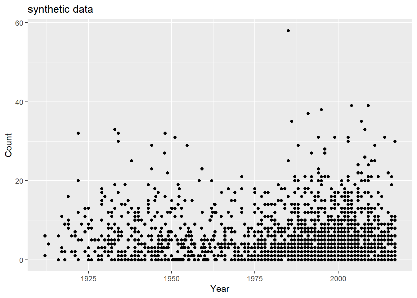
Now, we want to try to mimic the correlation between the total “Count” of the number of cases and “Year” of the reported counts - this correlation follows the shape of the distribution of “Year”, which makes sense. However, we may also want to associate lower count numbers with earlier years, as well.
## How close are we by nature of the year distribution alone?df =data.frame(Year = Year,Count = Count)totcount_year <-aggregate(Count ~ Year, data = df, FUN = sum) #Use aggregate() to find the sum count for each year valueggplot() +geom_point(data = totcount_year, aes(x = Year, y = Count)) +labs(x ="Year", y ="total Count")
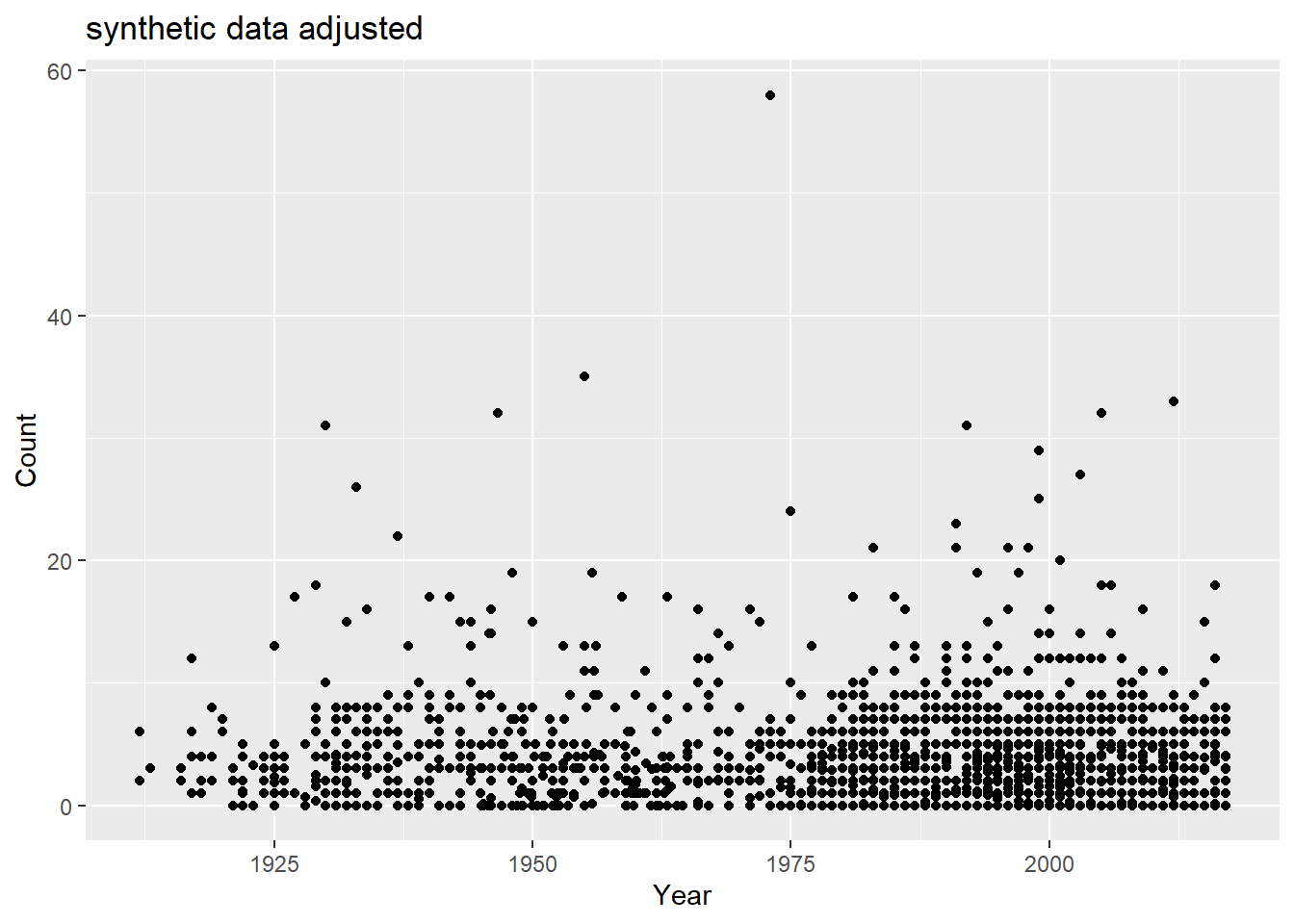
There’s a good amount of sums between 1925 and 1950 with low case counts, and a good number of low case counts in more recent years than Rachel observed. How do fix this? Lets take some of the case numbers from the middle (10-20) and randomly replace them with a random number between 0 and 5.
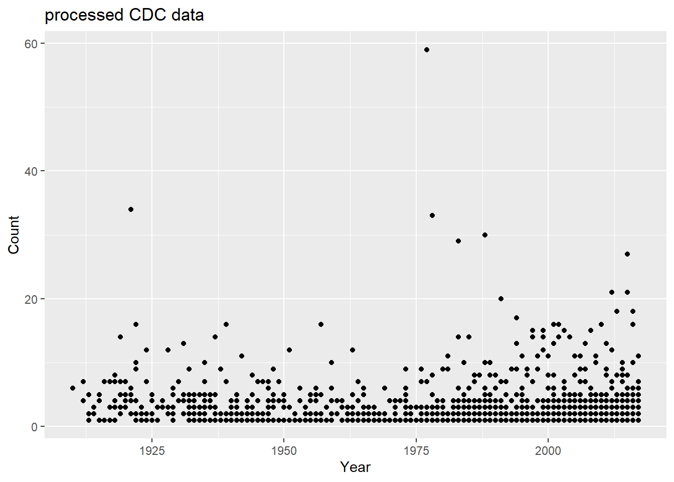
#lets take some of the case numbers from the middle (10-20) and randomly replace them with a random number between 0 and 5. range_toobig =range(which(sort(df$Count) >=10&sort(df$Count) <=40))df$Count =sort(df$Count)df$Count[sample(range_toobig[1]:range_toobig[2], size =diff(range_toobig)/1.5, replace = F)] =runif(diff(range_toobig)/1.5, 0,5)df$Count =sample(df$Count)ggplot() +geom_point(data = df, aes(x = Year, y = Count)) +labs(title ="synthetic data adjusted")
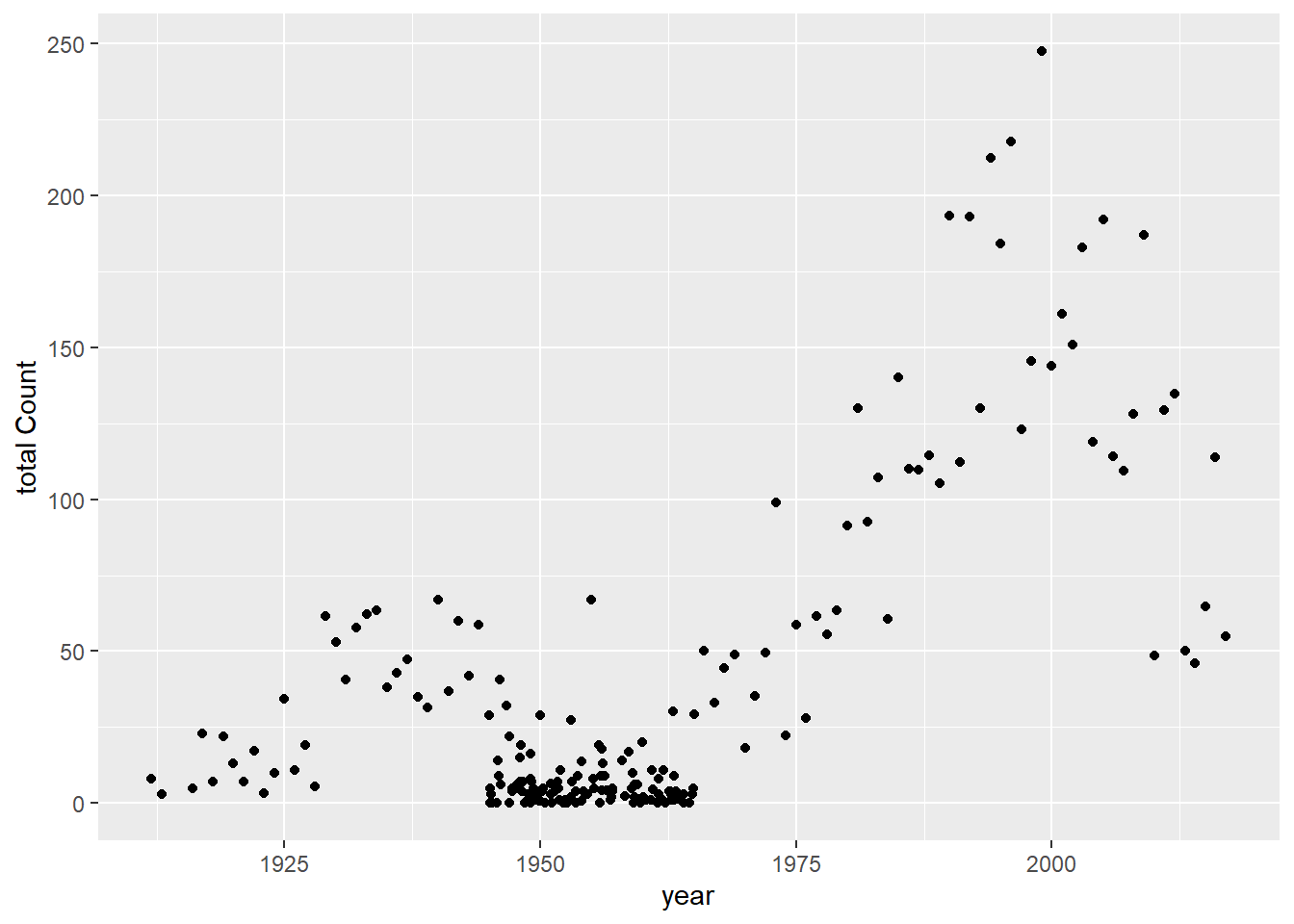
totcount_year <-aggregate(Count ~ Year, data = df, FUN = sum) #Use aggregate() to find the sum count for each year valueggplot() +geom_point(data = totcount_year, aes(x = Year, y = Count)) +labs(y ="total Count", x ="year")
Now, I’d like to try to add in some state data. Without data from California, it looks like the total counts for states are somewhat uniform between 0 and 200 total counts. However, a few states have higher numbers of total cases - these are Alaska, Oregon, Washington, New Jersey, and Colorado.
set.seed(123)#randomly generated a vector of state names whose frequencies are uniformly distributedstate_names =c(levels(factor(cdcdata5$State)))State =sample(state_names, size =1900, replace = T)df$State = State#reproduce plottotcount_state <-aggregate(Count ~ State, data = df, FUN = sum) #aggregate and sum the count by the state valueggplot(totcount_state, aes(x = State, y = Count)) +#use geom_point() to create a scatterplot for the total year count data frame that was createdtheme(axis.text.x =element_text(angle =90)) +#Rotate x axis labelsgeom_point() +labs(title ="Botulism Count for each State (except CA) in the U.S.", x ="State", y ="Total Case Count")
#so this clearly didn't work too well!
What i’d like to know is the frequencies of the observations of each state in the dataset, and to utilize these frequencies to determine whether the original observations were an artifact of reporting bias!
set.seed(123)#frequencies of each state in a named vectorstate_counts = cdcdata5 %>%group_by(State) %>%count()state_freqs = state_counts$n/nrow(cdcdata5)names(state_freqs) = state_counts$State#use frequencies to generate a vector of states with the same frequenciesState =sample(names(state_freqs), size =nrow(df), prob = state_freqs, replace = T)#add to df df$State = State#let's plot frequency totcount_state <-aggregate(Count ~ State, data = df, FUN = sum) #aggregate and sum the count by the state valueggplot(totcount_state, aes(x = State, y = Count)) +#use geom_point() to create a scatterplot for the total year count data frame that was createdtheme(axis.text.x =element_text(angle =90)) +#Rotate x axis labelsgeom_point() +labs(title ="Botulism Count for each State (except CA) in the U.S.", x ="State", y ="Total Case Count")
We’ve captured that states that report more have a higher OBSERVED total case count, and that doesn’t mean, necessarily, that botulism is more common there! So no further manipulation needed other than sampling states according to frequency of observations.
Lastly, I would like to add the BotTyp and ToxinType data to our synthetic data.
First, I will generate a vector of BotType using the frequencies of botulism types from the cdcdata5 processed dataset.
set.seed(123)#determine counts of BotTypesbotType_counts = cdcdata5 %>%group_by(BotType) %>%count()#determine frequencies of BotTypesbotType_freqs = botType_counts$n/nrow(cdcdata5)names(botType_freqs) = botType_counts$BotType#use frequencies to generate a vector of states with the same frequenciesBotType =sample(names(botType_freqs), size =nrow(df), prob = botType_freqs, replace = T) # for anyone reading this, notice how each of the arguments is dependent upon some other variable I've named, and I'm not direclty entering its value! It makes is a lot easier in the future to change something somewhere higher up in the pipeline, and be able to keep this code the same :)#add to df df$BotType = BotType#plot to be sure we've captured the nature of the true data!totcount_type <-aggregate(Count ~ BotType, data = df, FUN = sum) #Aggregate the count sum by the type of botulismggplot(totcount_type, aes(x = BotType, y = Count)) +geom_bar(stat ="identity") +labs(title ="Distribution of Botulism Type", x ="Type of Botulism Outbreak", y ="Total Count") #Make a bar plot with each differing identity of bot type listed on the x axis
Infant type botulism is slightly greater in number than foodborne, but to a slightly greater degree than in the original dataset. However, our goal is grasp the NATURE of the dataset, not to recreate it in its entirety. Hense, this is a probable distribution of Botulism by type!
Similar to the frequency approach used to generate the entires for each State and BotType observation, I will use the frequencies of each toxin type in the cdcdata5 dataset to generate a synthetic, possible distribution of cases by toxin type.
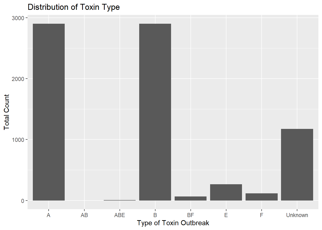
set.seed(123)#fount the number of each toxintypetoxType_counts = cdcdata5 %>%group_by(ToxinType) %>%count()#determine frequencies of BotTypestoxType_freqs = toxType_counts$n/nrow(cdcdata5)names(toxType_freqs) = toxType_counts$ToxinType#use frequencies to generate a vector of toxtypes with the same frequenciesToxinType =sample(names(toxType_freqs), size =nrow(df), prob = toxType_freqs, replace = T)#add to df df$ToxinType = ToxinType#plot to be sure we've captured the nature of the true data!totcount_type <-aggregate(Count ~ ToxinType, data = df, FUN = sum) #Aggregate the count sum by the type of toxinggplot(totcount_type, aes(x = ToxinType, y = Count)) +geom_bar(stat ="identity") +labs(title ="Distribution of Toxin Type", x ="Type of Toxin Outbreak", y ="Total Count") #Make a bar plot with each differing identity of bot type listed on the x axis
Here’s the potentially challenging bit - we’d like to be sure to capture the correlations between Botulism type and Toxin type (ToxinType). Rachel used a logistic regression to capture that toxin types A, B, E, and unknown are associated with the type of outbreak, and discovered in the literature that types A, B, and E are associated with foodborne outbreaks.
To try to capture this association, I will sort the BotType vector alphabetically. Then, I will randomly sample types “A”, “B”, and “E” according to their frequencies relative to the total number of these types, only, to generate a vector as long as the number of Foodboorne observations there are.
Then we will want to generate the rest of the Toxin_type data. They can be randomly selected according to their frequencies, but independent of the BotType with which they'll be associated.
However, now we need to adjust the probability of selecting “A”, “B”, or “E” according to however many were just selected, or their frequencies will be even higher!
set.seed(123)#arrange BotType alphabetically - starting with Foodborne - in the dataframe, dfdf = df %>%arrange(BotType)#determine the range of observations with bottype "foodborne"botType_range =range(which(df$BotType =="Foodborne"))#now, we want to sample from A, B, and E with their frequencies relative to the total number of A, B, and EABE_freqs = toxType_counts %>%filter(ToxinType =="A"| ToxinType =="B"| ToxinType =="E") # | means "or"foodborne_ToxTypes =sample(ABE_freqs$ToxinType, size =diff(botType_range), prob = ABE_freqs$n/sum(ABE_freqs$n), replace = T)#Now, we want to generate the rest of the Toxin_type data. They can be randomly selected according to their frequencies, but independent of the bottype with which they'll be associated.# first, we will determine their current frequencies with regard to the total number of observations:foodborne_ToxTypes_counts =as.data.frame(table(foodborne_ToxTypes))foodborne_ToxTypes_counts = foodborne_ToxTypes_counts %>%filter( foodborne_ToxTypes !="EF") #these toxtypes are not present in the processed cdc dataset and are an artifact of factoring foodborne_ToxTypes_counts = foodborne_ToxTypes_counts$Freq#now we will determine how many As, Bs, and Es are included in the df$ToxinType variable ToxType_counts = df %>%group_by(ToxinType) %>%count()ToxinType_counts = ToxType_counts$nnames(ToxinType_counts) = ToxType_counts$ToxinType#now, we will recalutalte the expected frequencies of the toxin types for the remainder of the toxintype variable vectorremaining_freqs_to_prob = (ToxinType_counts - foodborne_ToxTypes_counts)/(nrow(df)-diff(botType_range)) #we are dividing the remaining number of each toxintype that need to be included in the dataset by the total number of "spaces" (non Foodborne observations) left to fill in the dataset# finally! We get to replace the ToxinType variable with a vector of the foodborne probs (which will be listed first, next to the sorted foodborne recordings) and a sample for the other observations using these probabilities!df$ToxinType =c(as.character(foodborne_ToxTypes), sample(names(ToxinType_counts), size =nrow(df)-diff(botType_range), prob = remaining_freqs_to_prob, replace = T))#lets see if we've maintained the frequency distribution of the data: totcount_type <-aggregate(Count ~ ToxinType, data = df, FUN = sum) #Aggregate the count sum by the type of toxinggplot(totcount_type, aes(x = ToxinType, y = Count)) +geom_bar(stat ="identity") +labs(title ="Distribution of Toxin Type", x ="Type of Toxin Outbreak", y ="Total Count") #Make a bar plot with each differing identity of bot type listed on the x axis
The distribution is nearly unchanged, but now most A, B, and E values occur in the same observations as foodborne BotTypes.